
In today’s article, we’re moving beyond printing numbers in the console and creating some data visualization plots in both the terminal and in a graphical window. We’re also going to have fun! 😀
Today, I’m going to make the inductive leap that you’re making all of this happen using a Raspberry Pi. You may be able to implement these amazing ASCII terminal plots in the Windows world using Bash on Windows, but I have not tested in that context. In addition to Raspbian, these steps will also generally work for other Linux distros as well as OS X. If you are not running Node.js on your Raspberry Pi, please see my Beginner’s Guide to Installing Node.js on a Raspberry Pi. You can also see my article on Using Visual Studio Code with a Raspberry Pi if you are seeking to set up a development environment. For this tutorial, the Leafpad text editor, installed by default with Raspbian, may suffice.
Create a CPU Sensor Reading Stream to Plot
There are a number of sensor readings we could plot, but today we will plot the CPU load sensor that we built in previous articles such as this one. For this tutorial, let’s create a file called cpuSensor.js and add the following code:
'use strict';
const os = require('os');
const delaySeconds = 1;
const decimals = 2;

function loop() {
  console.log(cpuLoad());
  setTimeout(loop, delaySeconds * 1000);
}

function cpuLoad() {
  let cpuLoad = os.loadavg()[0] * 100;
  return cpuLoad.toFixed(decimals);
}

loop();
From the terminal, issue the following command to ensure you are seeing sensor readings printed to the console:
node cpuSensor.js
You should see values appearing on the screen every second:
7.62
7.05
7.05
7.05
6.95
....
Excellent – we are churning out sensor readings! Let’s move on with some data visualization for our sensor readings.
Terminal-based Data Visualization
We could jump right to data visualization in a graphical window, but why not do some ASCII plots first? There is quite a bit that can be done using ASCII, so let’s not miss out on the fun!
First, let’s install a Debian package called feedgnuplot. This package provides a command-line-oriented frontend to the venerable Gnuplot package. It will also install Gnuplot since Gnuplot is a dependency of the feedgnuplot package. We’ll use one of the newer apt commands discussed in my apt tutorial. Here we go:
sudo apt install feedgnuplot
Accept all of the defaults when prompted. Multiple dependencies will install including Gnuplot.
Next, create a file called plotTerminal.sh that we can use as a shell script so we don’t have to type everything from the command prompt each and every time. Add the following contents to this shell script:
#!/bin/bash
clear
node cpuSensor.js | feedgnuplot --lines --title "CPU Sensor Plot" --xlabel seconds --xlen 100 --terminal "dumb `tput cols`,`tput lines`" --stream
There’s quite a bit going on in this command so let me explain what we’re doing before you run it. We are using the cpuSensor.js code we created earlier to stream the CPU load readings into the feedgnuplot command using the “|” character. Many of the feedgnuplot parameters are self documenting, but we use “–terminal” to create a terminal plot and “xlen” to specify a scale of 100 for our x axis. This will ensure that a given point on the plot will take 100 seconds to travel through before it disappears off the screen since our Node.js sensor program loop runs every second. Finally, the tput commands contained between backticks are used to dynamically ascertain the number of columns and lines in the terminal we are running so we can maximize the terminal plot.
You *may* also need to set the executable bit on the plotTerminal.sh command before you can run it as follows:
chmod u+x plotTerminal.sh
Next, maximize your terminal window so we can get a nice big plot.
Finally, go ahead and run your newly created command and let’s get this terminal plot cranked up:
./plotTerminal.sh
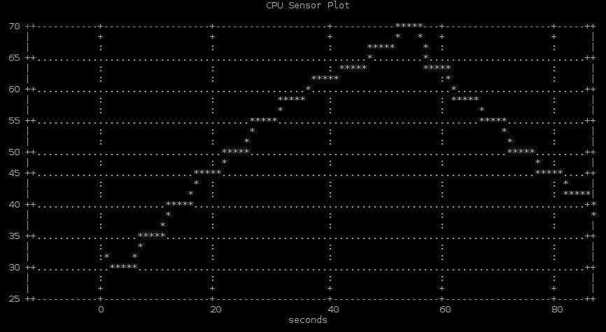
You have now officially created a data visualization solution for your CPU sensor! After about 60-90 seconds, a number of CPU sensor readings will populate your terminal plot and it will generally look something like this. The screenshot here is shown after applying some CPU loading which I will explain next; therefore, the y values on your plot (CPU loading values) may be more flat for the time being.
Since the CPU activity may be fairly flat, let’s exercise the CPU so we can watch it change. In a separate terminal, install the sysbench utility so we can do some load testing:
sudo apt install sysbench
Accept all of the defaults when prompted.
Enter the following command to crank up the CPU loading on your RasPi:
sysbench --test=cpu --cpu-max-prime=20000 run
Jump back to the other terminal window containing your plot. You should see the CPU loading values beginning to rise. After watching your CPU load climb on the plot, go back to the other terminal window and enter Ctrl+C to terminate the sysbench program. Observe how the CPU sensor value slowly drops back down as the CPU is provided relief from the intensive activity introduced by sysbench. When you are ready, enter Ctrl+C to terminate the plotTerminal.sh program too.
Congratulations on creating a cool terminal plot!
Graphical-based Data Visualization
Next, we’ll create a data visualization plot in a graphical window. We have already laid the foundation in the previous sections so this next step should go quickly.
First, create a file called plotGraphical.sh that we can use as a shell script so we don’t have to type everything from the command prompt. Add the following contents to this shell script:
#!/bin/bash
clear
node cpuSensor.js | feedgnuplot --lines --title "CPU Sensor Plot" --xlabel seconds --xlen 100 --terminal "qt" --stream
The major difference this time is that we are passing “qt” as the value for the “terminal” parameter so it will use the qt framework to create a graphical window rather than creating a plot in the terminal window.
Once again, you *may* need to set the executable bit on the plotGraphical.sh command before you can run it as follows:
chmod u+x plotGraphical.sh
Finally, go ahead and run your newly created command:
./plotGraphical.sh
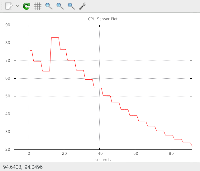
A graphical plot will launch in a new window. After a couple of minutes, your plot will generally look something like this:
To exit, you will need to hit Ctrl+C from the terminal window you used to launch the “plotGraphical.sh” script since the graphical window will continue to regenerate itself otherwise.
Conclusion
We utilized some tools to enable us to visualize the data from a sensor including both a terminal (ASCII) visualization and a graphical visualization. The sensor values could have been from the physical world, but we utilized a built-in “sensor” in the form of CPU load this time around. In a future tutorial down the road, we will add a web-based method for data visualization to our toolkit.
Come back again next time for more Node.js IoT tutorial fun!
Follow @thisDaveJ on Twitter to stay up to date on the latest tutorials and tech articles.
Related Articles
Beginner’s Guide to Installing Node.js on a Raspberry Pi
Visual Studio Code Jumpstart for Node.js Developers
Node.js Learning through Making – Build a CPU Sensor
Node.js IoT – Build a Cross Platform CPU Sensor

One thought on “Node.js IoT – Data Visualization of Sensor Values”